CAP's New Tool Will Break It Down for You
by Craig Jennings, 3/26/2010

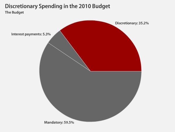
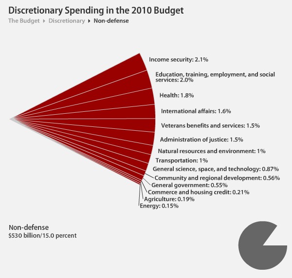
The Center for American Progress has put up a neat interactive federal budget chart.
Click on the slices of the federal budget pie to see where non-defense discretionary dollars actually go. At the finest level of detail, you can click to read brief descriptions of what these programs really do. The percentages indicate the share of total federal funding that goes to that particular slice. Take a look around and decide for yourself if slashing non-defense discretionary spending is really as painless as some say it is. You might be surprised at what you find.
Images are stills from CAP's interactive chart.